While I am not able to display certain items due to confidentiality, I look forward to sharing more about my creative process and experience in-person!
PRIMARY CASE STUDY: MyERApp
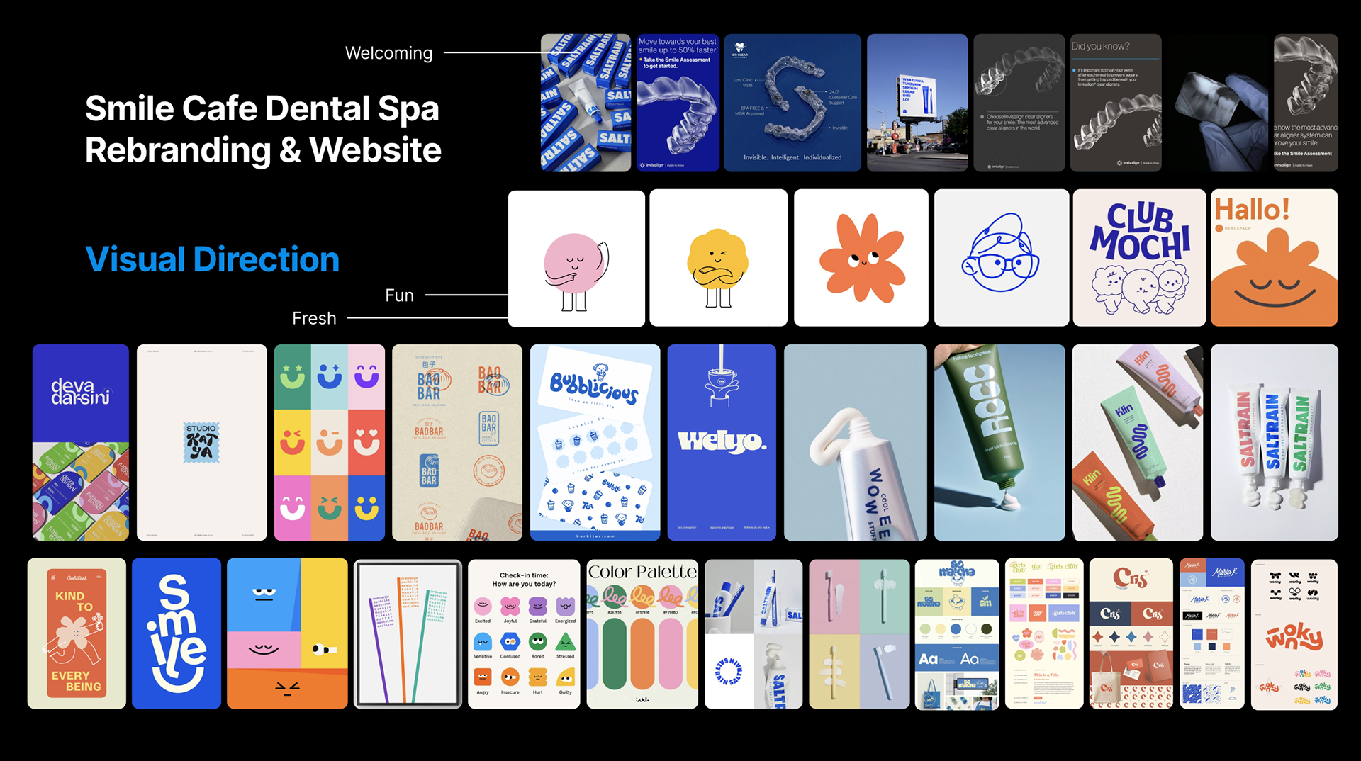
Emergency Dental Network | Product Design, UX, Branding
Problem
Patients experiencing dental emergencies often lack immediate access to care. Existing systems are fragmented, requiring phone calls, manual searches, or delayed appointments, resulting in increased pain, anxiety, and inefficiency.
Clinics, on the other hand, struggle with managing urgent requests, triaging patients, and maintaining real-time availability across systems.
Users need a way to access trusted, real-time emergency dental care because current pathways are slow, unclear, and disconnected.
Constraints
1. Zero-to-one product: No existing product foundation, required full conceptualization from scratch
2. High-stakes use case: Emergency context demanded speed, clarity, and reliability in UX
3. Dual-sided platform: Needed to design for both patients and doctors with distinct workflows
4. Healthcare considerations: Required intuitive handling of sensitive data (insurance, records, identity)
5. Startup velocity: Rapid design cycles with limited time for extended validation
Process
1. UX Research & System Framing
Mapped end-to-end emergency journeys (symptom-search-booking-treatment).
Identified key friction points: discovery, trust, urgency, and availability.
Defined core system: real-time connection between patients and verified providers.
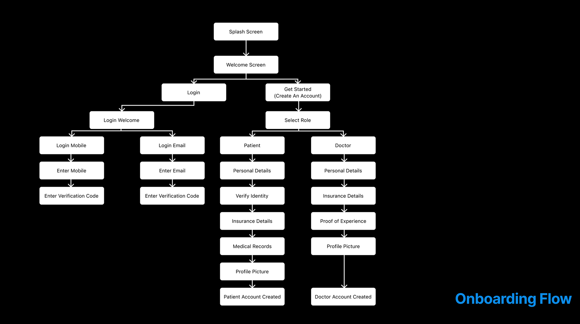
2. Information Architecture & Flows
Designed full onboarding ecosystem for both user types.
Structured patient vs doctor flows to reduce cognitive load.
Built multi-step onboarding (identity, insurance, records) for credibility.
The onboarding flow diagram with a split system architecture:
Patients: personal details - insurance - medical records
Doctors: credentials - verification - profile creation
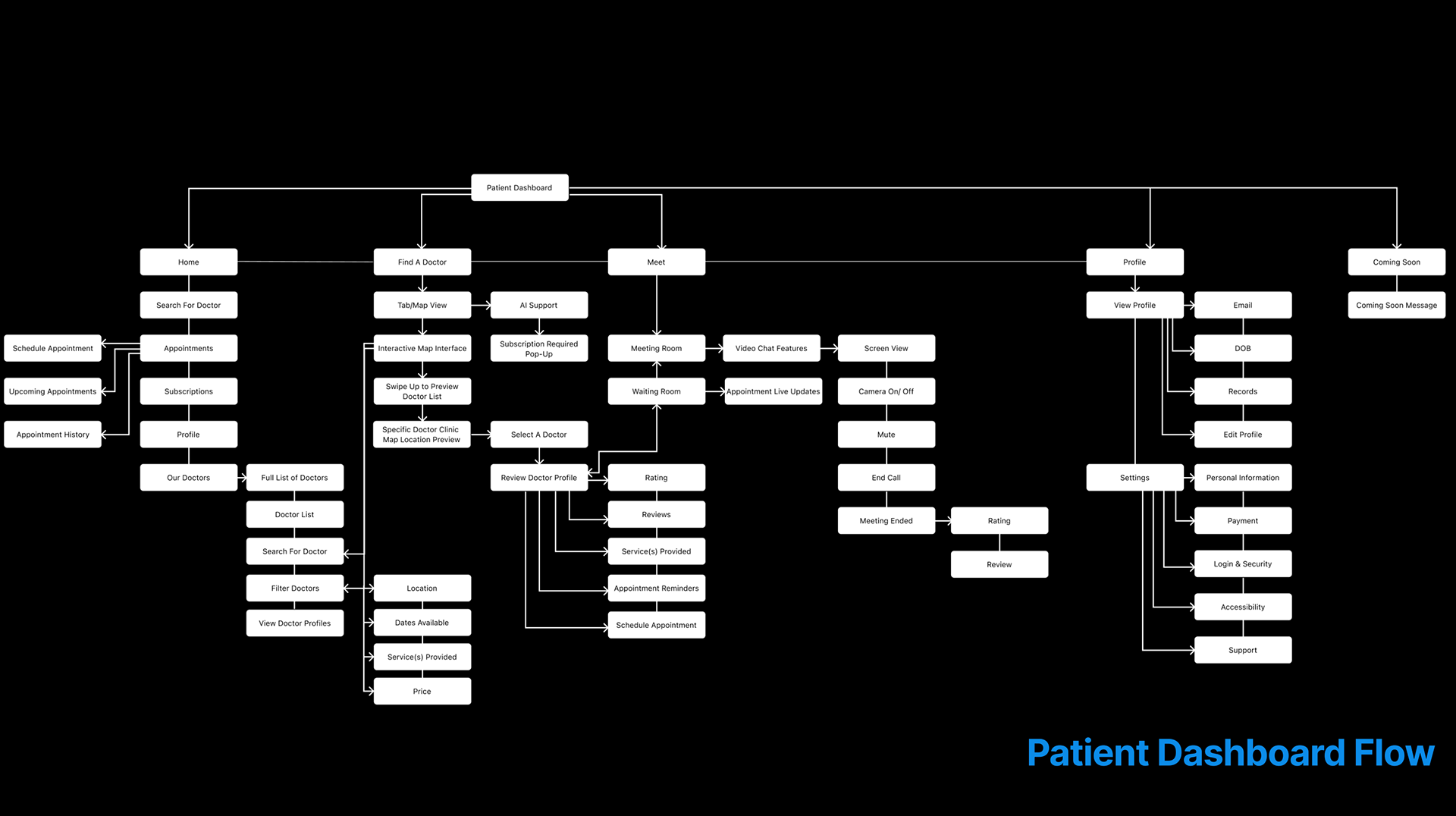
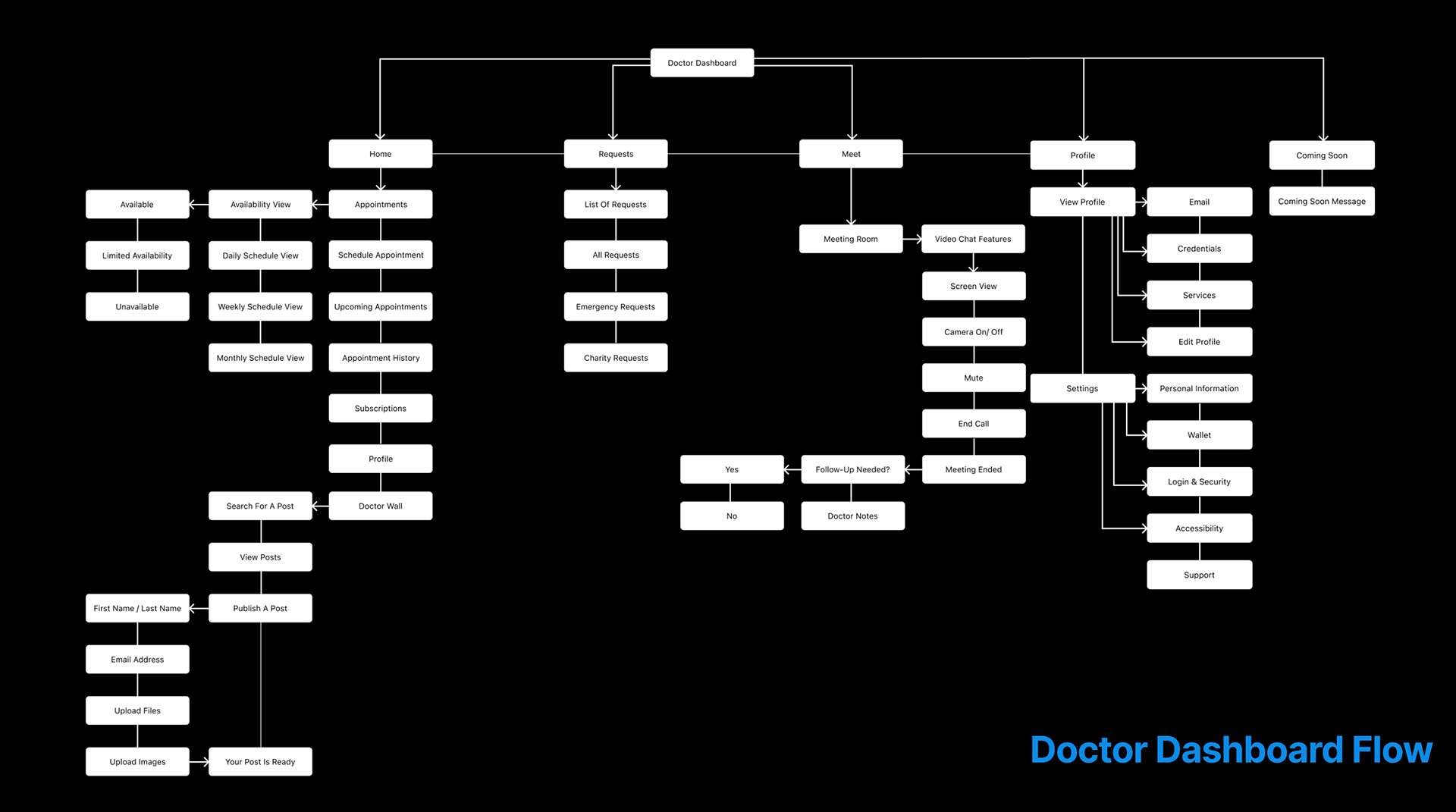
3. Interaction & Interface Design
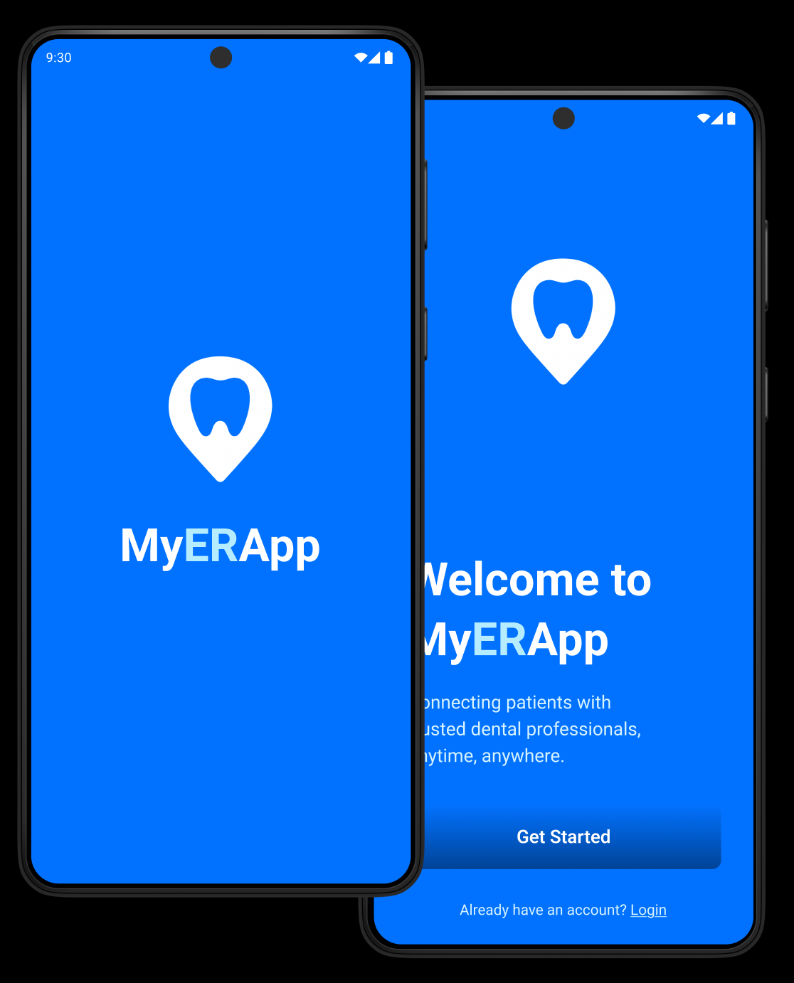
Created high-fidelity mobile-first UI system
Designed core flows:
Find a doctor (location-based) - Book instantly - Manage appointments - Access medical data
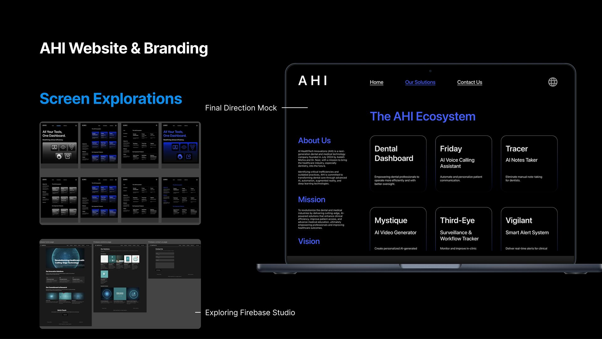
The dashboard architecture for a fully built product ecosystem: covers appointments, search, messaging, and profiles
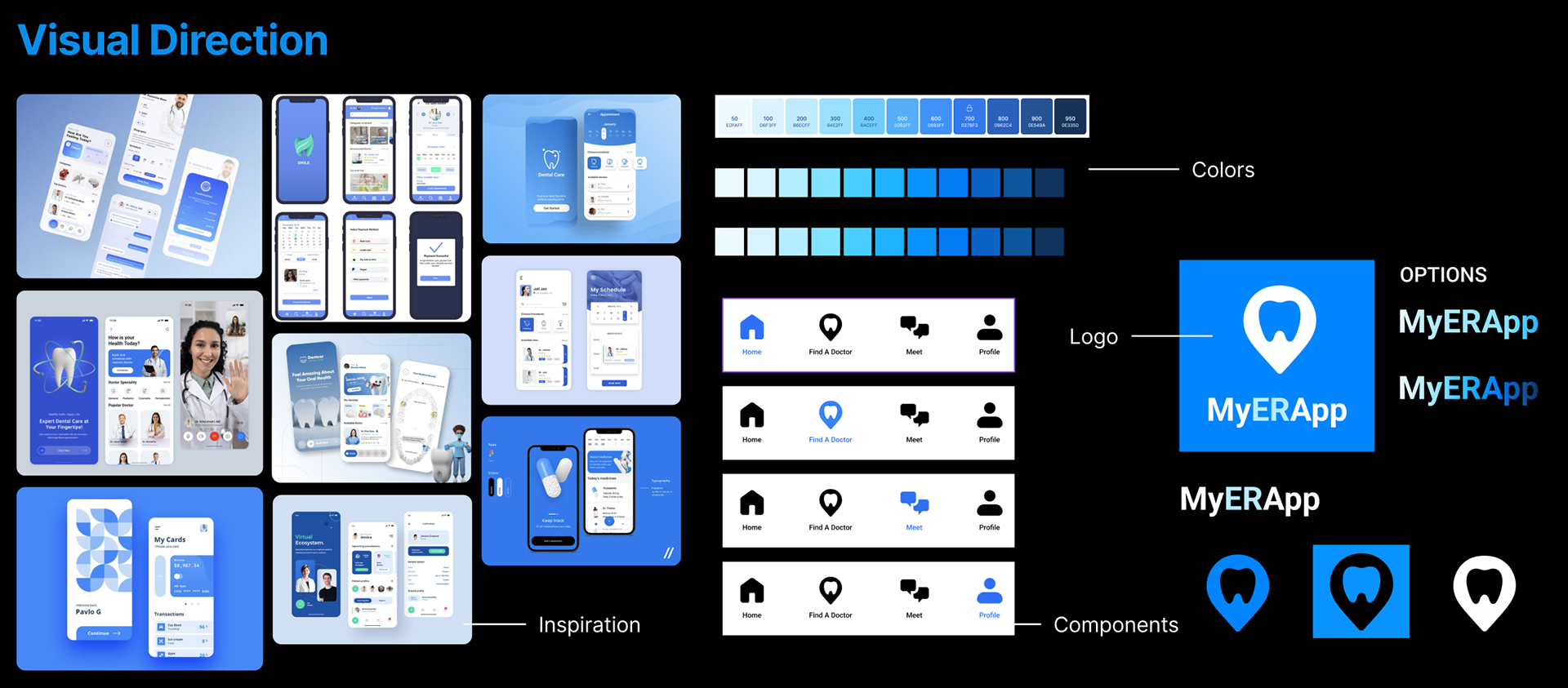
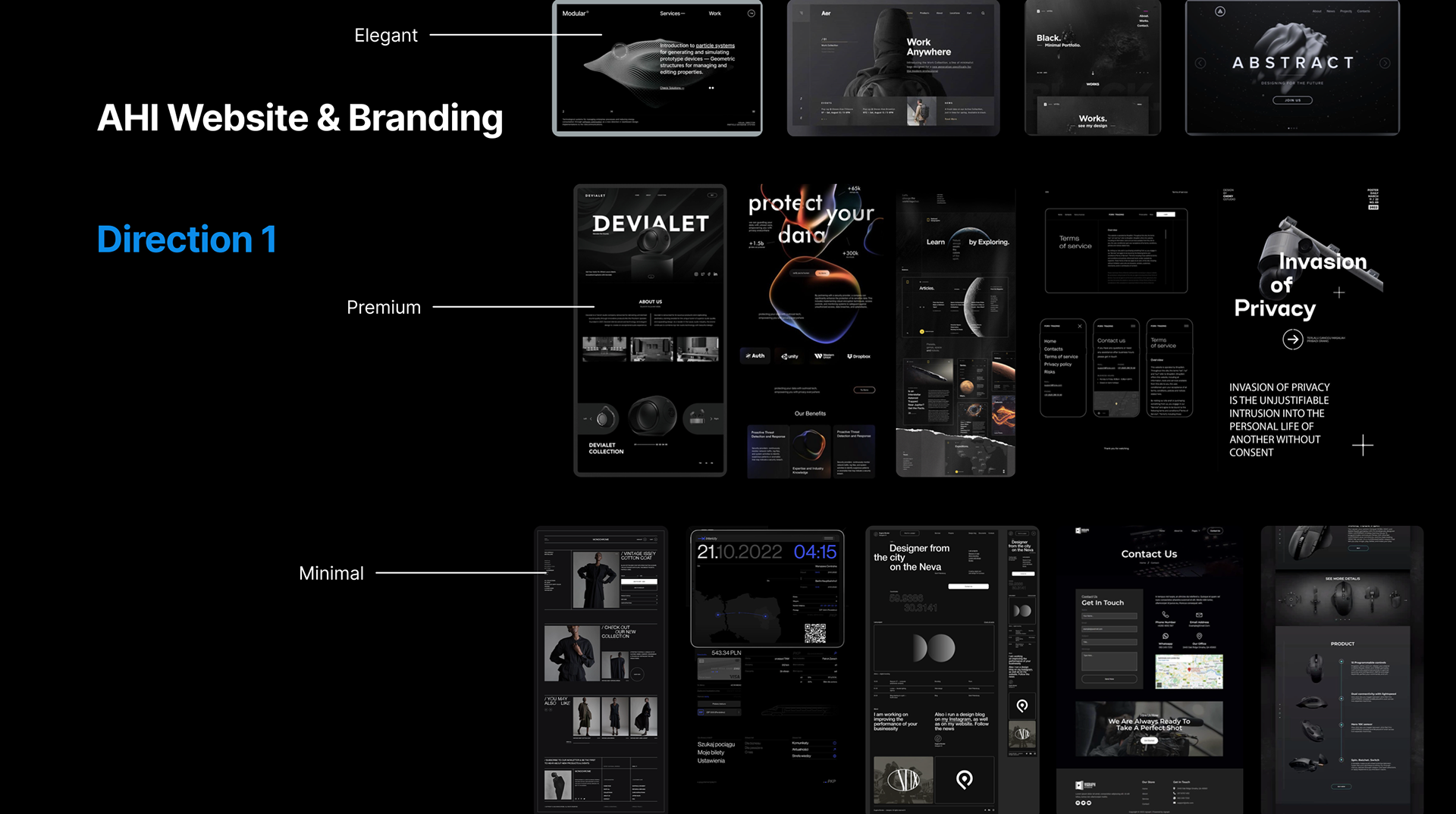
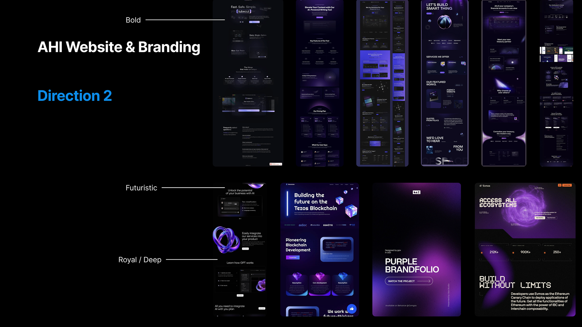
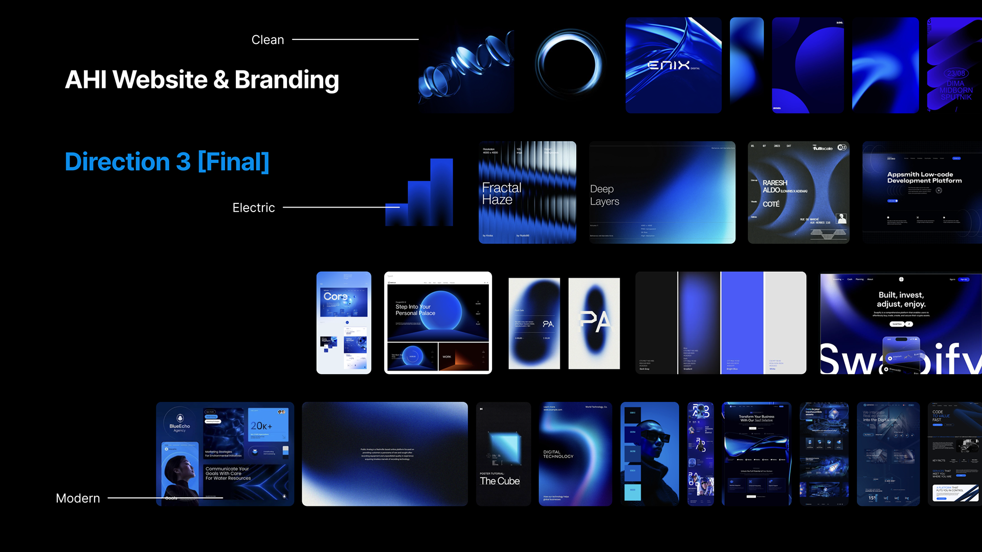
4. Branding & Visual System
Developed a clean, clinical yet accessible identity
Blue-toned palette to signal trust, urgency, and healthcare reliability
Built scalable UI components and iconography system
Key Decisions
1. Prioritized Speed Over Feature Density
Emergency context required reducing friction:
- Minimized steps to book care
- Designed direct CTAs (“Find a Doctor”, “Book Now”)
Emergency context required reducing friction:
- Minimized steps to book care
- Designed direct CTAs (“Find a Doctor”, “Book Now”)
2. Separated Patient vs Doctor Experiences
Instead of forcing a unified system, created parallel flows:
Patients - fast access, minimal input
Doctors - structured data input and availability control
Instead of forcing a unified system, created parallel flows:
Patients - fast access, minimal input
Doctors - structured data input and availability control
3. Built Trust Through Structured Onboarding
- Introduced verification layers (insurance, credentials, records)
- Balanced speed with legitimacy
- Introduced verification layers (insurance, credentials, records)
- Balanced speed with legitimacy
4. Designed as a System, Not Just Screens
- Developed full ecosystem: onboarding, dashboards, booking, profiles
- Ensured scalability for future features (at-home care, messaging, records)
- Developed full ecosystem: onboarding, dashboards, booking, profiles
- Ensured scalability for future features (at-home care, messaging, records)
Outcomes
Delivered a fully realized end-to-end product prototype (concept - system - UI)
Created one of the most comprehensive projects within the AHI ecosystem
Established a scalable framework for emergency healthcare platforms
Demonstrated ability to handle:
1. Complex user flows
2. Multi-sided platforms
3. High-pressure use cases
1. Complex user flows
2. Multi-sided platforms
3. High-pressure use cases
A fully realized emergency dental network app connecting patients to care in real time
Reflection
This project marked a shift from interface design to systems thinking.
Designing for urgency required precision, every interaction had to justify itself. I learned to balance speed, trust, and usability within a single experience, while also managing the complexity of a dual-sided platform.
More importantly, this project reinforced that in healthcare, design is not just about usability, it directly impacts access, decision-making, and well-being.
Impact
Positioned MyERApp as a viable healthcare product concept, not just a design exercise
Reduced friction in emergency care access through streamlined UX
Contributed to a broader AI-driven healthcare ecosystem (AHI) by defining a critical access point
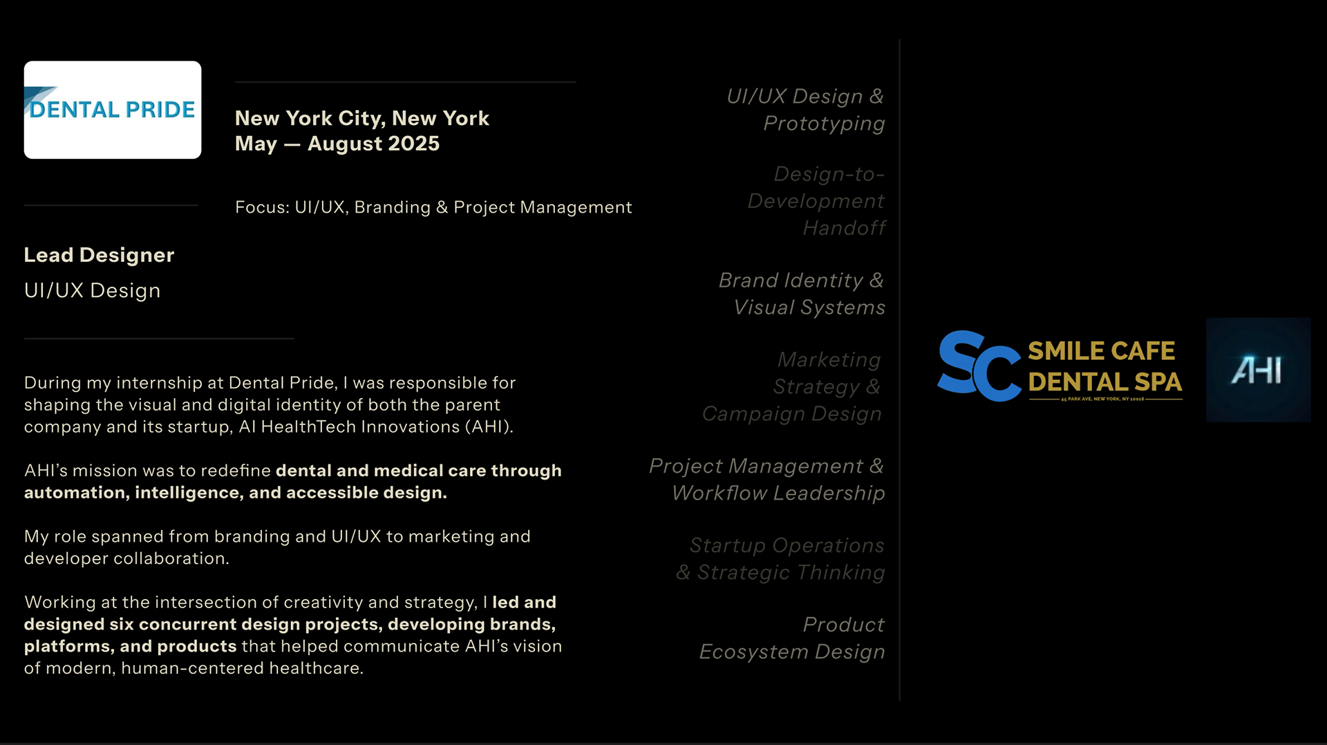
KEEP SCROLLING TO LEARN MORE ABOUT MY RESPONSIBILITIES & IMPACT AS LEAD DESIGNER AT DENTAL PRIDE!
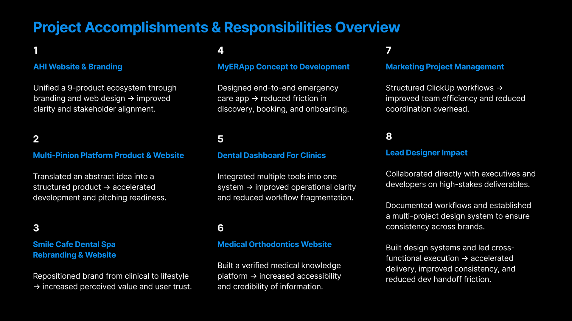
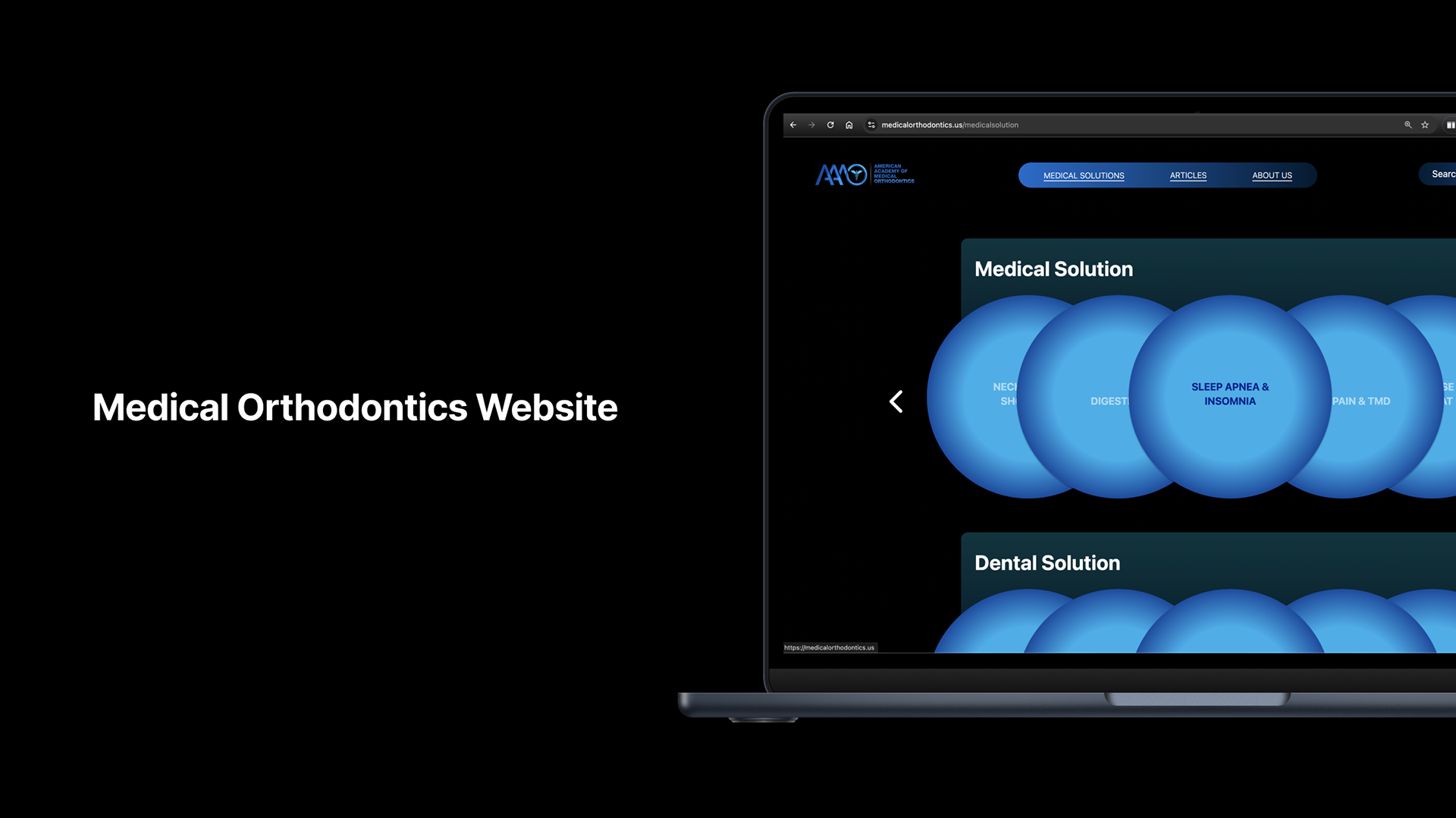
Role Context: Beyond Individual Products | Lead Designer, Dental Pride | AI HealthTech Innovations (AHI)
While MyERApp represents a deep, end-to-end product case study, my role at Dental Pride extended across a broader ecosystem of products, systems, and operations. I worked as the central design lead within a fast-moving startup environment, shaping not only interfaces, but the structure, consistency, and execution of multiple parallel initiatives.
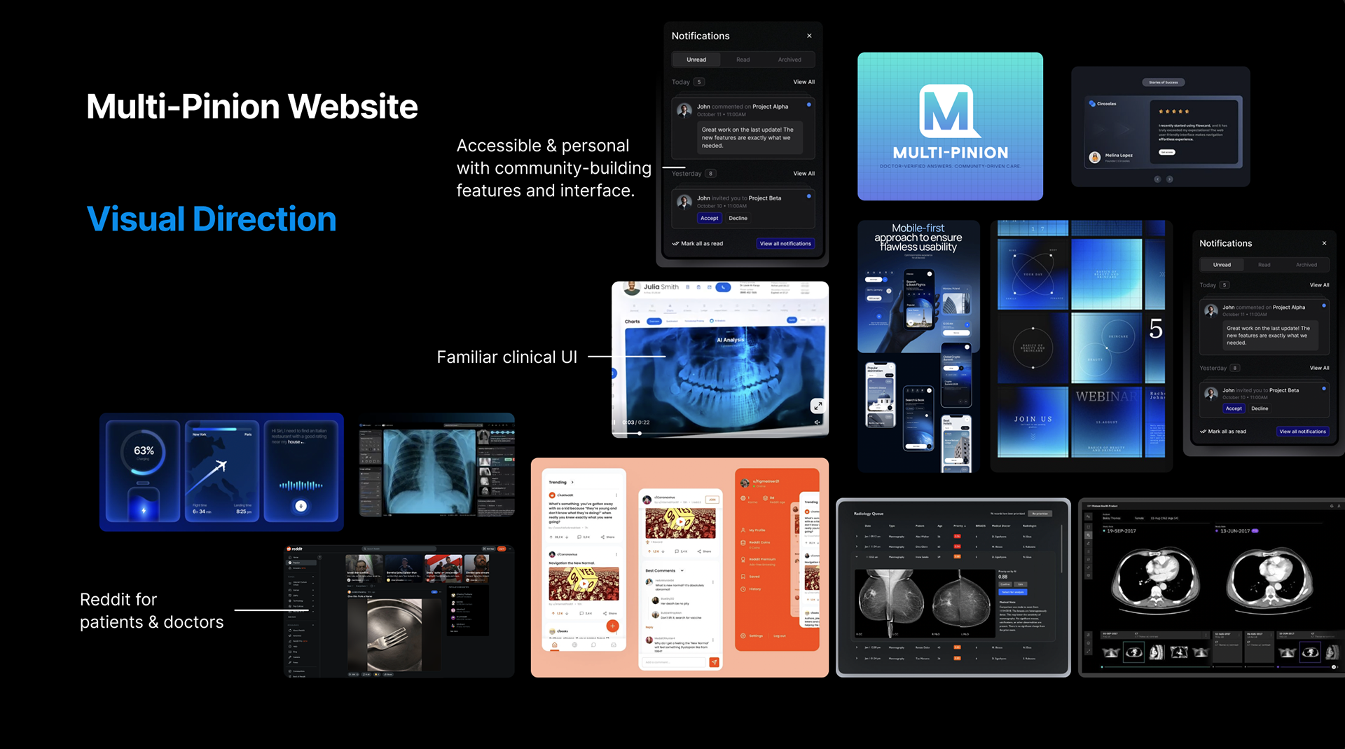
Designing Across a Multi-Product Ecosystem
AHI operated as a startup with nine distinct digital products, each addressing different gaps in dental and medical workflows. Rather than treating these as isolated projects, I approached them as a connected system.
I developed a unified visual language and design logic that could scale across:
1. Patient-facing applications
2. Internal dashboards
3. Marketing platforms
4. Web experiences
This ensured that each product felt consistent, credible, and part of a larger, cohesive ecosystem rather than a collection of disconnected tools.
Building Scalable Design Systems
To support rapid development, I established repeatable design systems and workflows that could be applied across projects. This included:
1. Component libraries for mobile and web
2. Typography and color systems aligned with healthcare UX standards
3. Structured UI patterns for dashboards, onboarding, and data visualization
These systems allowed for faster iteration cycles while maintaining consistency across products being developed simultaneously.
Owning the Design-to-Development Pipeline
I worked closely with developers in a highly iterative environment, ensuring that design translated accurately into production. My responsibilities included:
1. Creating high-fidelity prototypes and responsive layouts that did not compromise user experience.
2. Conducting design QA to maintain functional & visual integrity
3. Preparing structured handoff files for efficient implementation
4. This reduced ambiguity in development and improved the overall quality and speed of delivery.
Cross-Functional Collaboration & Execution
Operating in a startup setting required constant coordination across teams. I collaborated directly with:
1. Founders and executives on product direction
2. Developers on feasibility and implementation
3. Marketing teams on campaigns and rollout strategies
In addition, I managed workflows using tools like ClickUp, helping organize tasks across design, content, and development pipelines.
Bridging Product, Brand, and Strategy
My role sat at the intersection of: Product Design (UX, flows, interfaces), Brand Design (identity, visual systems, storytelling) & Strategy (positioning, product clarity, user value)
This allowed me to shape not just how products looked, but how they were understood and experienced, both by users and stakeholders.
Operating Under Startup Constraints
The environment demanded speed, adaptability, and precision. Within a three-month period, I contributed to the delivery of six complete design systems and brand packages, while supporting multiple product tracks simultaneously.
This required:
1. Prioritizing effectively across competing deadlines
2. Making decisive design choices with limited validation cycles
3. Maintaining quality across a high volume of output
Impact on MyERApp and Beyond
This broader role directly informed the development of MyERApp.
The systems, workflows, and design principles I established across AHI enabled me to approach MyERApp not as an isolated app, but as part of a larger healthcare infrastructure.
The systems, workflows, and design principles I established across AHI enabled me to approach MyERApp not as an isolated app, but as part of a larger healthcare infrastructure.
Takeaway
This experience shifted my perspective from designing individual interfaces to orchestrating product ecosystems.
I learned how to:
1. Design at scale across multiple touchpoints, focusing on user experience and optimizing visual design workflows.
2. Align design decisions with business and technical realities
3. Build systems that support both speed and consistency
Ultimately, my role at Dental Pride was not just about execution, it was about creating structure within complexity, and translating that into clear, usable, and scalable design solutions.