RESEARCH | RATIONALE | IDEATION & ITERATIONS
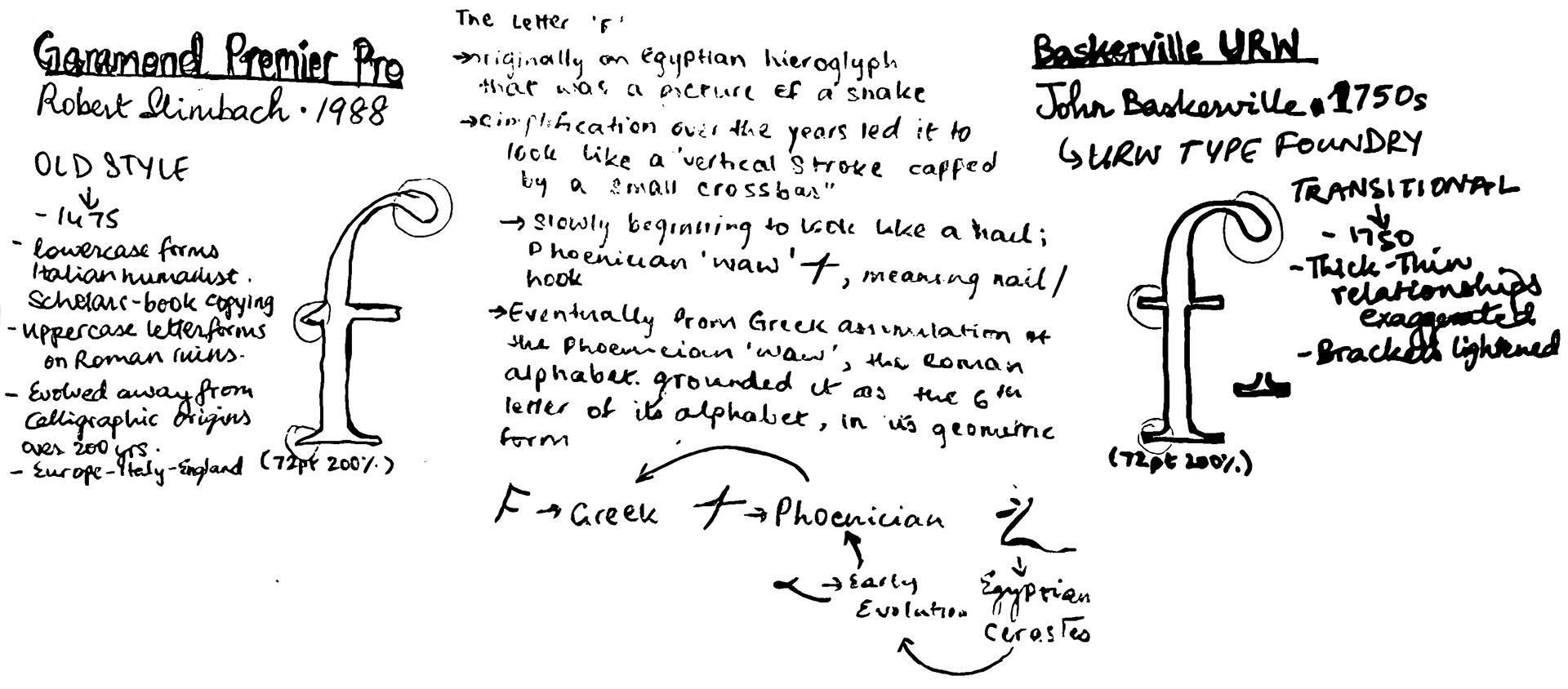
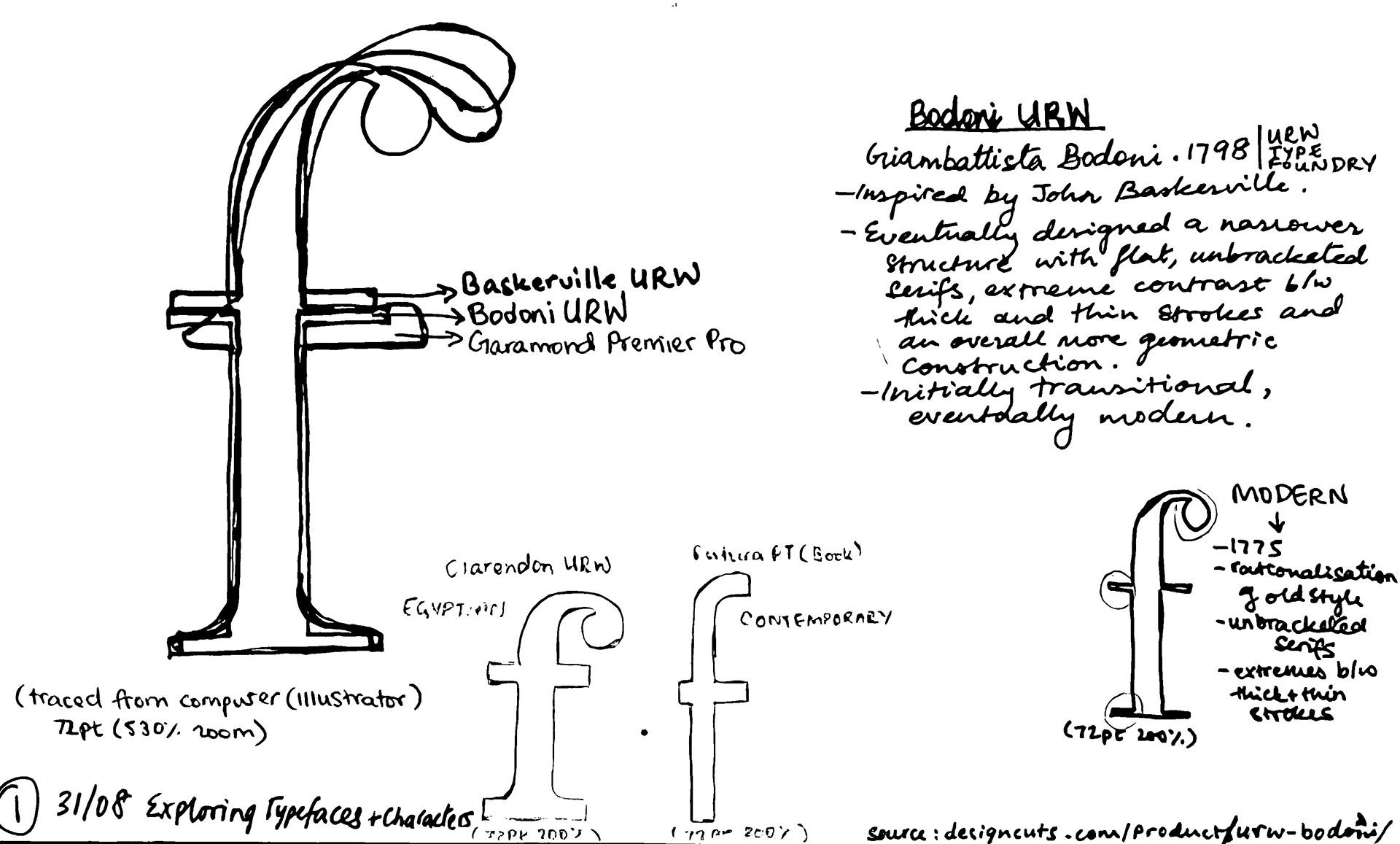
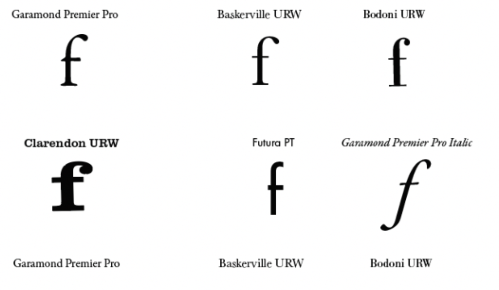
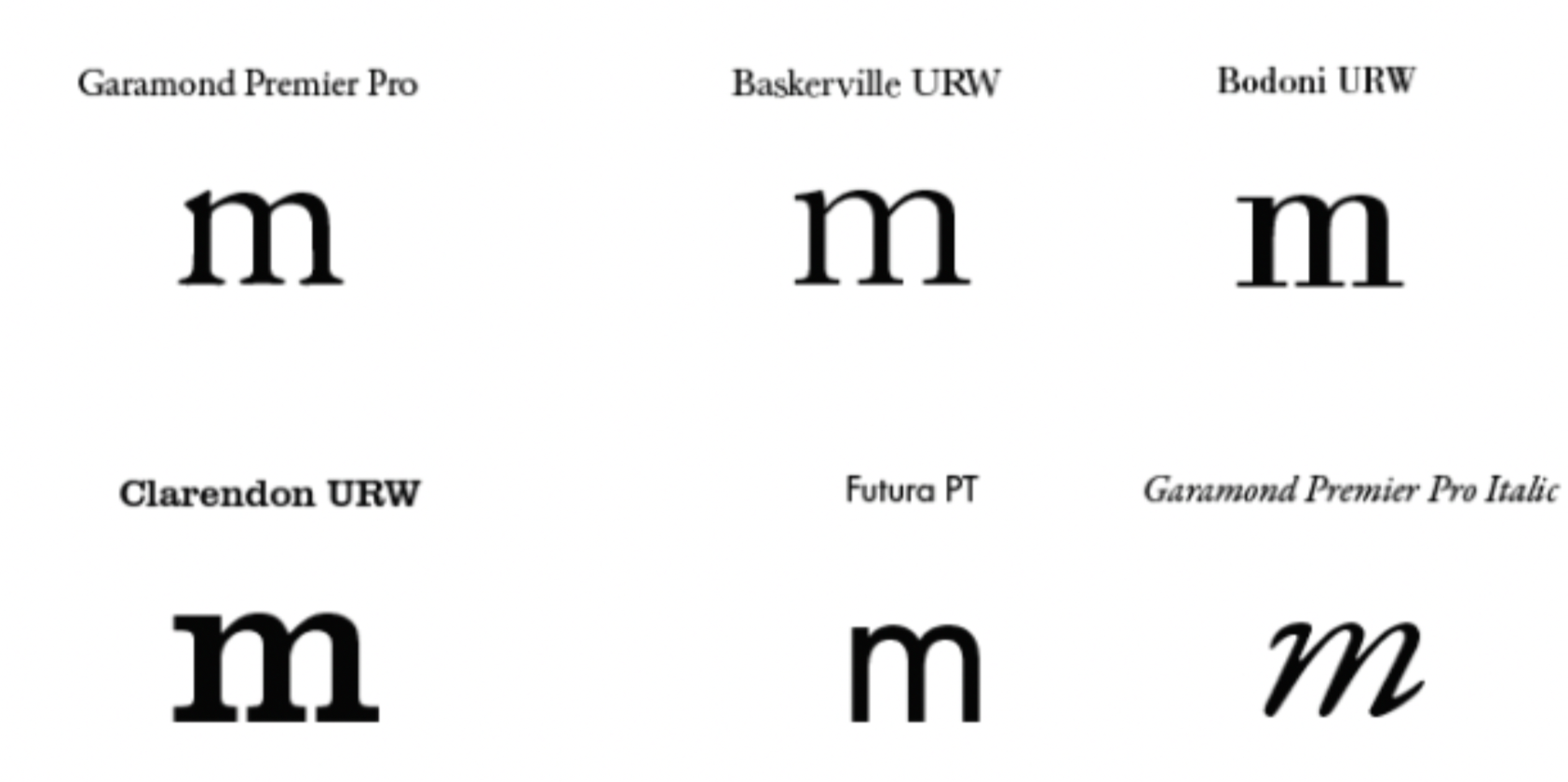
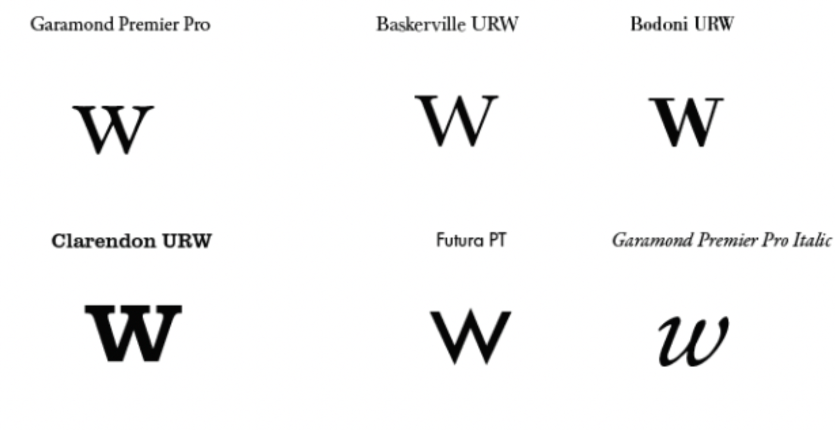
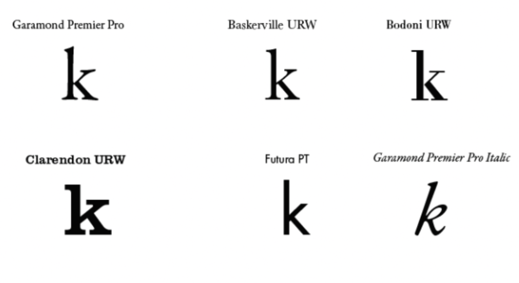
In order to understand and familiarise myself with different type classifications, I looked at Modern, Transitional, and Old Style fonts and their characteristics.
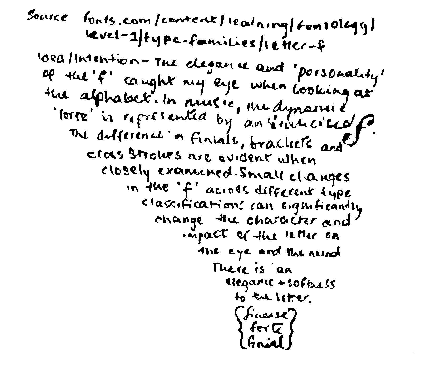
I had an initial inclination towards the letter ‘f’ for it is commonly found in music to indicate the dynamic for
loudness, ‘forte’.
loudness, ‘forte’.
As a musician, its italicised typeface carries with it an elegance and a soft phonetic sound likened to the words ‘finial’, ‘flourish’, and ‘finesse’.
I found the small yet stark and defining characteristics of each typeface intriguing since they brought their own unique character and flair to the letter.
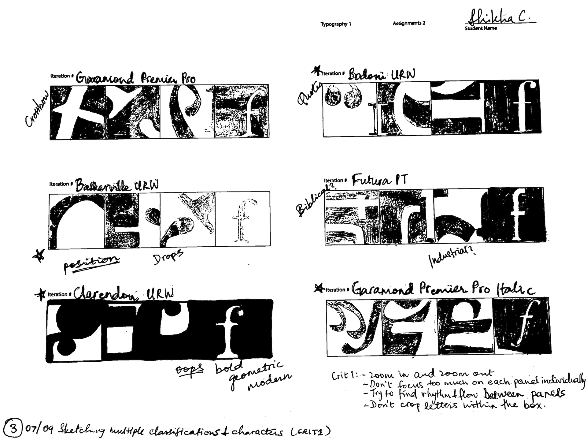
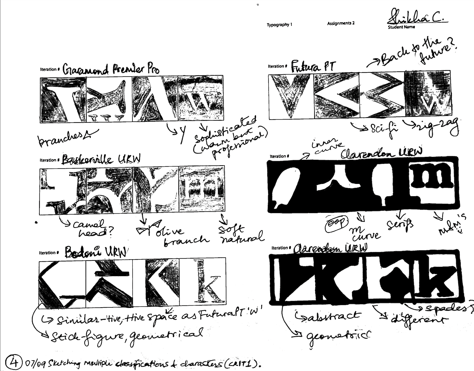
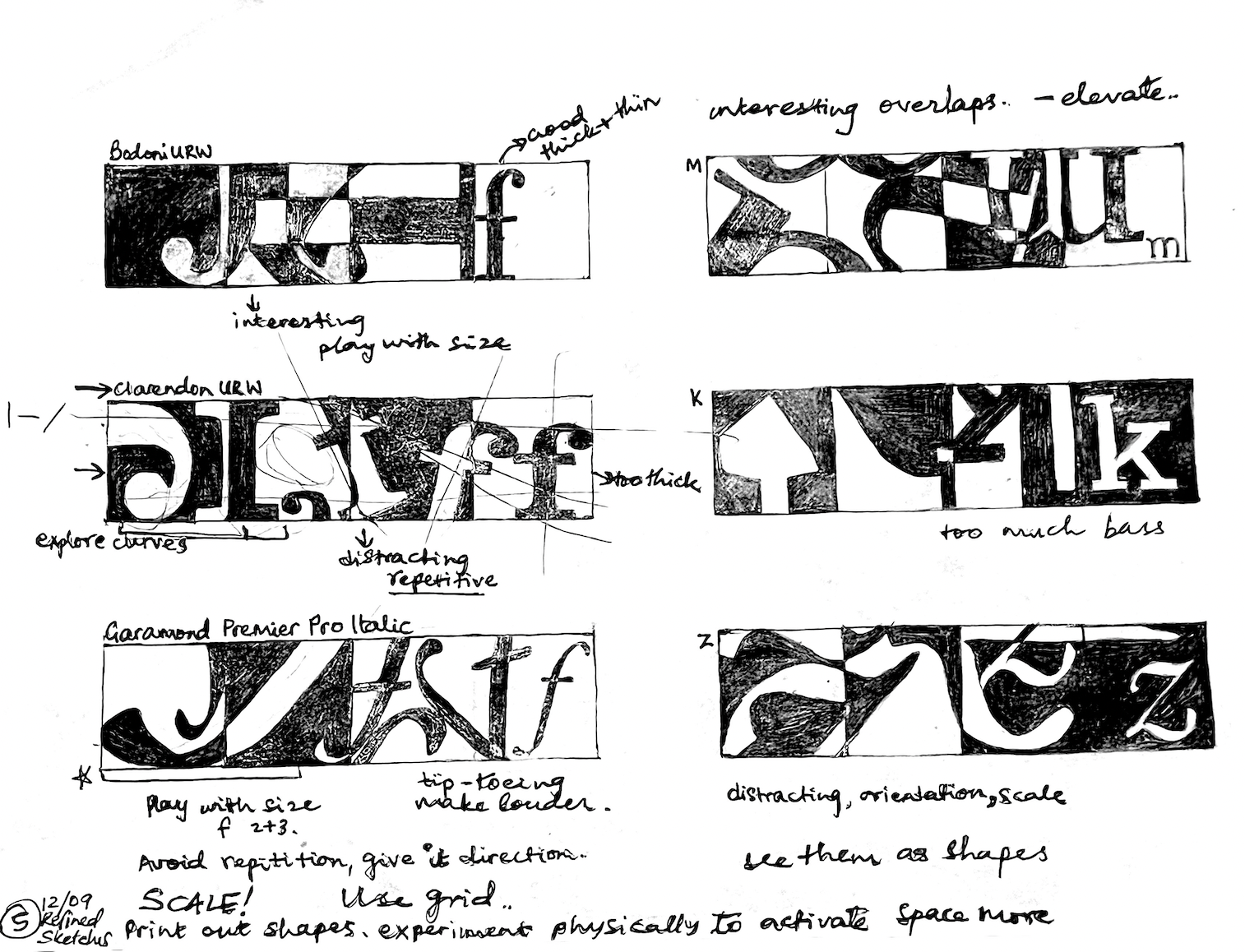
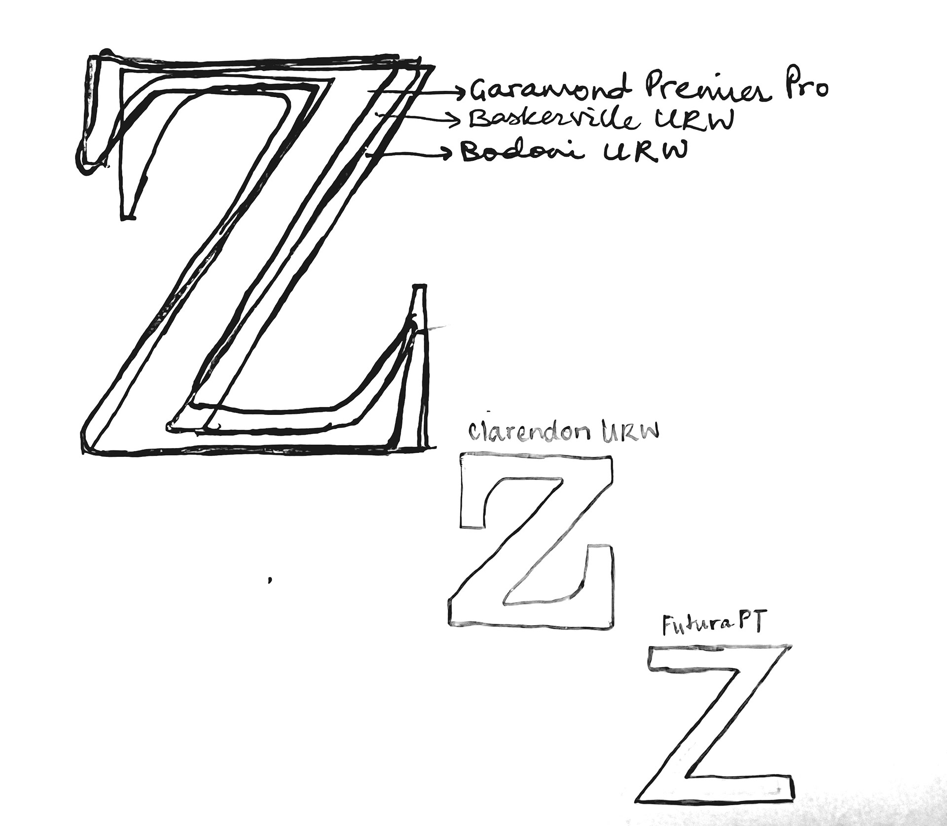
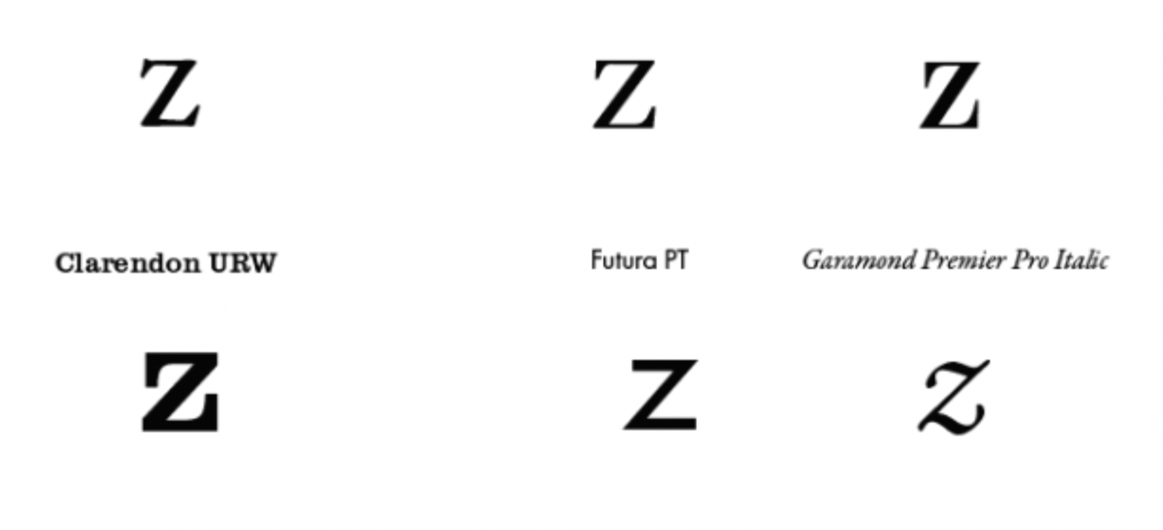
I then proceeded to look at the formation of the letter ‘f’ in different fonts and how certain arms, serifs and finials could be translated onto other characters like z, k, w and m.
I did 12 experimentation panels of different letters and typefaces before narrowing it down to three fonts: Bodoni URW, Clarendon URW, and Garamond Premier Pro Italic.
With these refined sketches, I felt confident enough to start studying these characters on the computer using
Adobe Illustrator.
Adobe Illustrator.
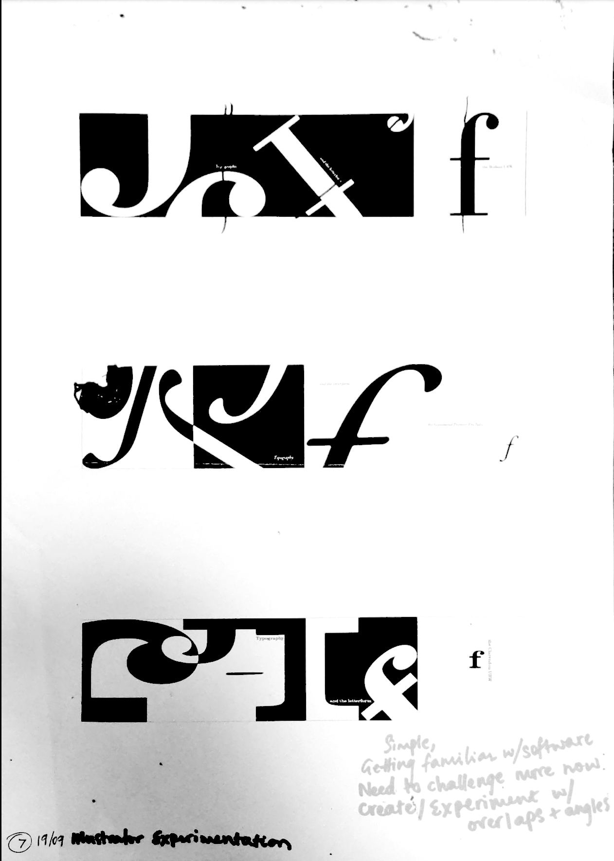
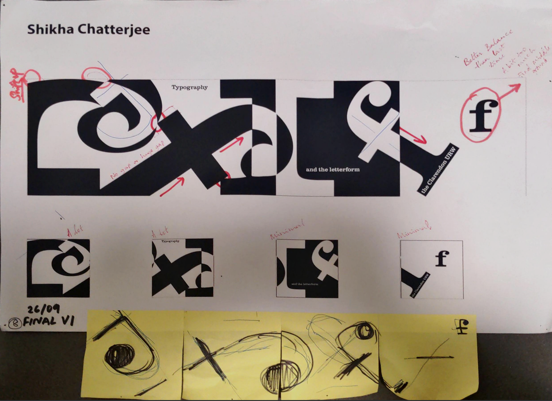
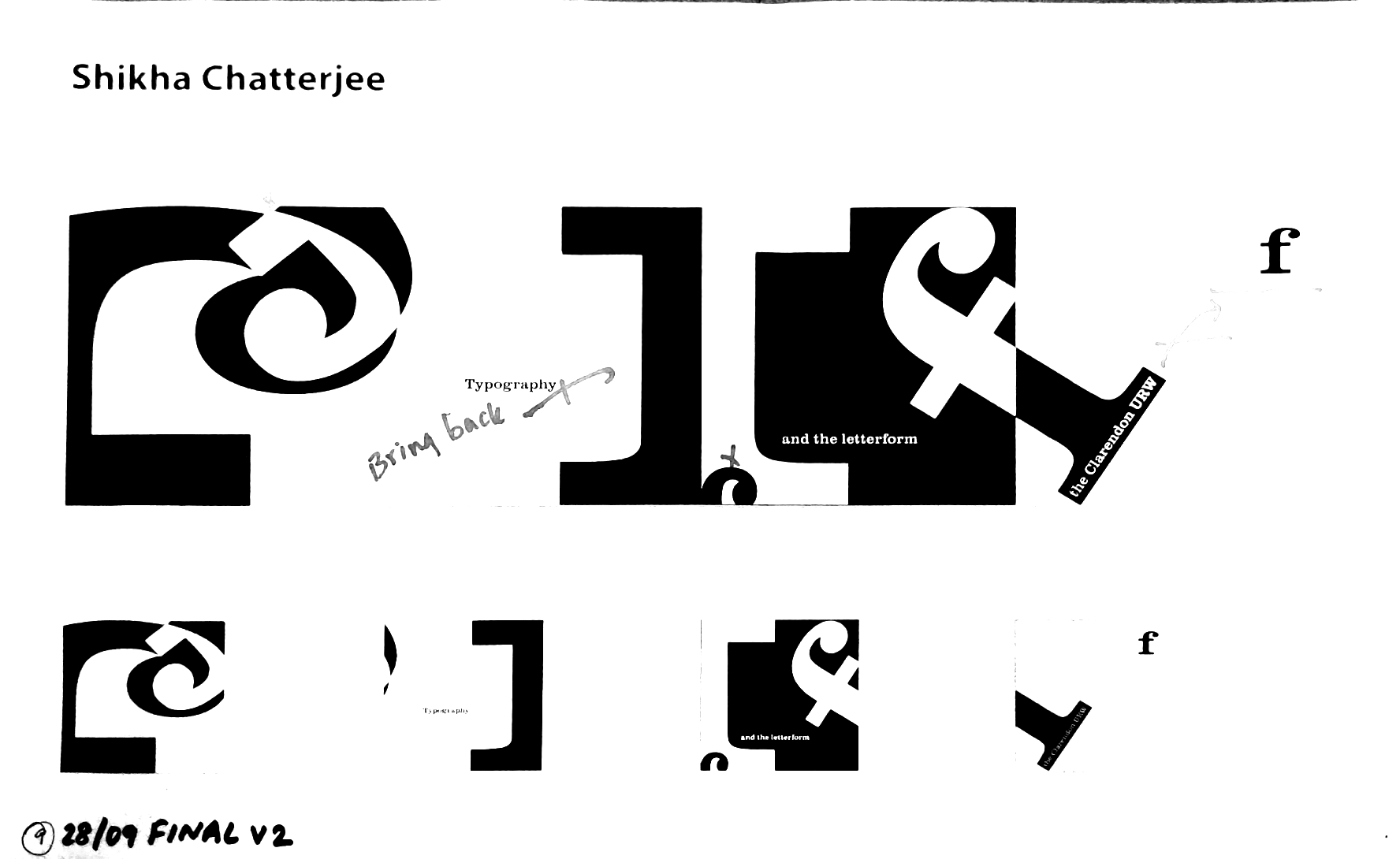
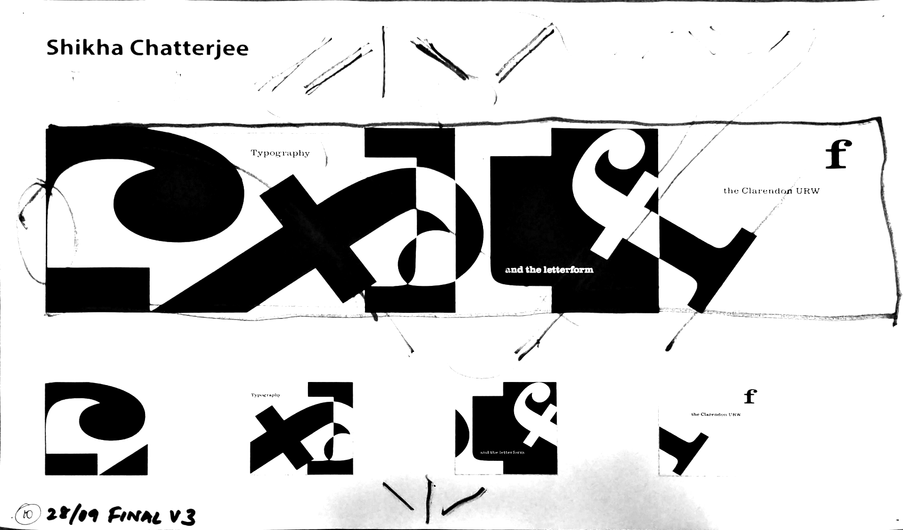

EXPERIMENTING WITH ILLUSTRATOR
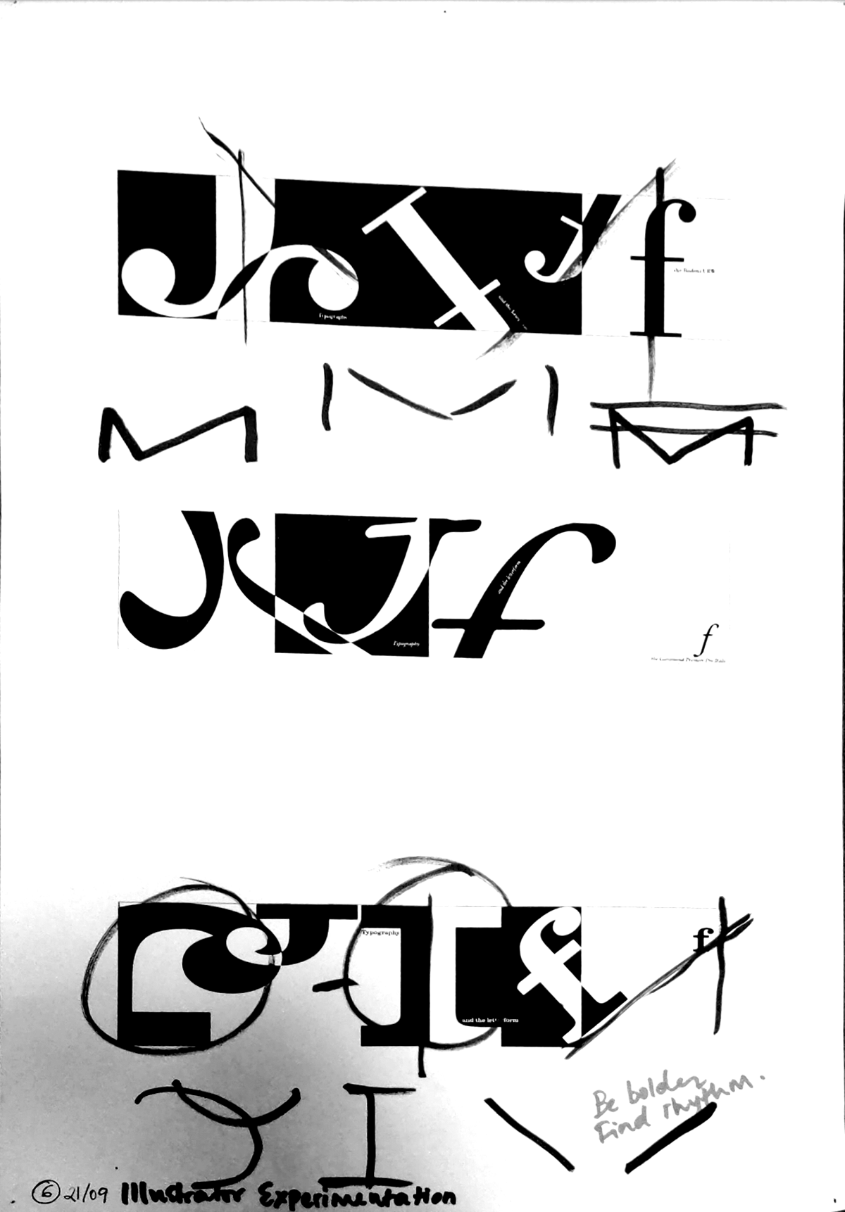
My initial prints of Illustrator-produced iterations were minimal and focused on getting the basic form of the letter and adhering to the set parameters.
With my second set of iterations, I challenged myself more with overlaps and complex combinations in order to get closer replications of the detailing I had achieved with my initial manual sketches on paper.
PRODUCING FINAL COMPOSITIONS
I chose the Clarendon URW ‘f’ as the letter of focus in my final composition.
Through my various iterations, I enjoyed the geometric playfulness of this particular letter and typeface.
The first panel struck me because of the interesting negative the finial and serif created when enlarged.
It took four variations of the ‘final’ to arrive at what seemed to be the most harmonious and balanced combination
of letterforms.
of letterforms.
REFLECTION
This project introduced me to the world of type and composition. Through the various critiques, iteration and Illustrator experiments, I learnt how to navigate not only digital software and spaces but also the fundamentals of rhythm, visual balance and composition within design.
I enjoyed the research stage and understanding the design theory and history behind type since it gave me a better sense of how and why certain classifications and letterforms came into existence.
Using Adobe Illustrator was a challenge at first but with practice, it became easier to navigate. I appreciated the critiques from peers and faculty, they were useful checkpoints along the way.
Breaking the assignment down into steps made the whole process realistic and manageable.
Moving forward I want to keep experimenting with Illustrator and dive a little deeper into type history and culture while further solidifying my understanding of its classifications.
